Title: Stop Letting Buttons Ruin Your Shot: Mastering Safe Zones for TikTok & Reels
There is a very specific type of heartbreak reserved for content creators.
You know the one.
You’ve spent two hours getting the lighting perfect. You nailed the transition on the third try. You edited the clip to the beat of the trending audio.
It looks like a masterpiece in your camera roll.
Then, you upload it to TikTok or Instagram Reels.
Suddenly, your head is cut off by the search bar. Your punchline is buried under the caption. The "Like" button is obscuring the product you’re trying to sell.
It’s frustrating. It’s unprofessional. And worst of all, it hurts your engagement.
At My Core Pick, we see this happen way too often.
Great content is being suffocated by bad formatting.
The interface of these apps is cluttered, and it’s constantly changing. If you aren't editing with the user interface (UI) in mind, you are essentially flying blind.
Today, I’m going to walk you through exactly how to master the "Safe Zones."
We are going to ensure your content looks just as good on the feed as it does in your editor.
Let’s clean up your frame.
The Anatomy of the "Dead Zone"
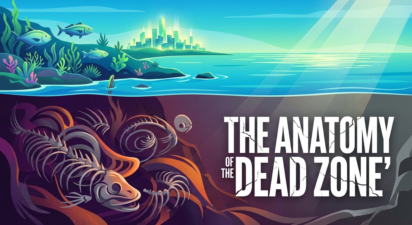
Before we look at where we can put things, we need to understand the enemy.
I like to call the edges of the screen the "Dead Zones."
These are the areas where the platform—be it TikTok, Instagram, or YouTube Shorts—overlays its own buttons and text.
If you place visual information here, it dies.
The Right Rail (The Engagement Column)
This is the most obvious offender.
On the right side of the screen, you have a vertical stack of buttons.
The profile picture. The heart icon. The comment bubble. The bookmark/save icon. The share arrow. And finally, the spinning record (the audio source).
This column takes up a significant amount of real estate.
If you are filming a "talking head" video and you position yourself slightly to the right, you might end up with a heart icon over your left eye.
If you put text there, people have to peer through the UI to read it. Spoiler alert: they won’t bother.
The Bottom Third (The Caption Creep)
This area has become the most dangerous zone in recent years.
Why? Because platforms are encouraging longer captions and SEO-driven descriptions.
TikTok now allows for massive captions. Instagram displays the username, the audio track, the location, and the first two lines of your caption right over your video.
This isn't just a thin strip at the bottom anymore.
Depending on the device your viewer is using, the bottom 20% to 30% of your screen is essentially unusable for important visuals.
The Top Banner (The Search Trap)
We often forget about the top of the screen.
However, both TikTok and Reels place overlay text here.
You have the "Following/For You" tabs on TikTok. On Instagram, you have the camera icon and the search interface.
If you put your headline text at the very top of the frame, it will clash with the app’s navigation.
It looks messy, and it makes your video feel low-quality immediately.
Why "Safe Zones" Dictate Your Success
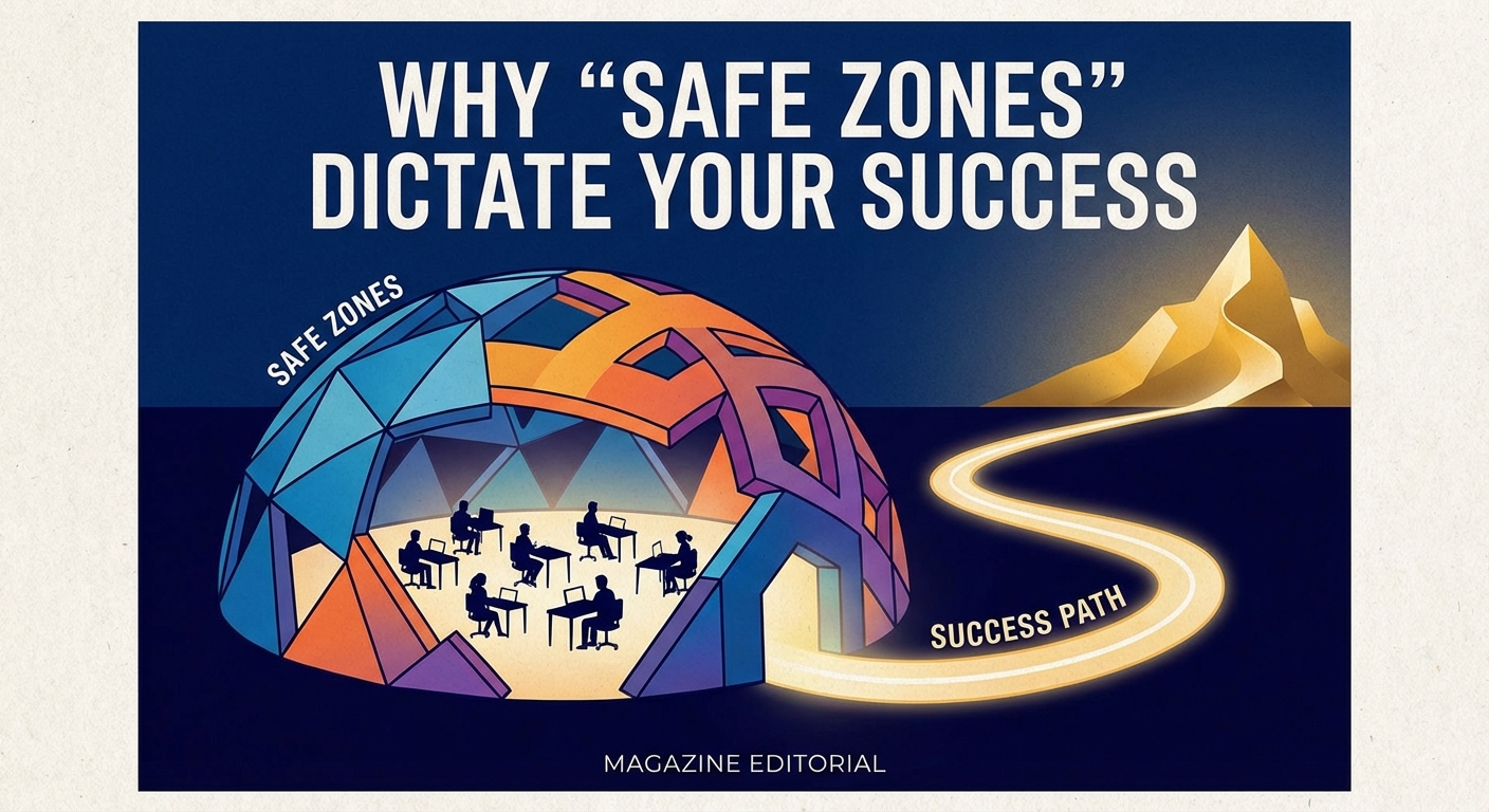
You might be thinking, "Okay, so a button covers a letter. Does it really matter?"
Yes. It matters immensely.
Here at My Core Pick, we analyze a lot of engagement data.
There is a direct correlation between visual clarity and watch time.
Reducing Cognitive Load
When a user scrolls through their feed, their brain is processing information at lightning speed.
They are making a decision to stay or scroll in a fraction of a second.
If your hook text is half-covered by a "Share" button, the brain hits a stumbling block.
It creates what designers call "cognitive friction."
The viewer has to squint or guess what the text says.
In the brutal economy of short-form video, friction is fatal. The moment it becomes hard to consume your content, the thumb flicks up, and you are gone.
The "Amateur" Aesthetic
Beyond readability, ignoring safe zones signals that you are an amateur.
It tells the viewer, "I didn't think this through."
Top-tier creators, brands, and influencers have this nailed down.
Their text sits perfectly nestled in the negative space. Their face is centered. Their product is unobstructed.
When your video fits the interface perfectly, it feels native to the platform.
It subconsciously builds trust.
The Magic Dimensions: Where to Actually Edit
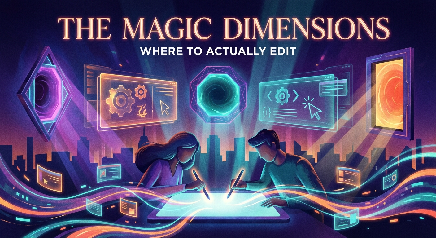
Let’s get technical for a moment.
We are working with a 9:16 aspect ratio. That is typically 1080 pixels wide by 1920 pixels tall.
But you don't have access to all those pixels.
I’m going to give you the rough measurements you should keep in your head (or taped to your monitor).
The Vertical buffer
You need to sacrifice the top and bottom of your screen.
The Top: Stay clear of the top 15% of the screen. This accounts for the notch on newer phones, the battery/time indicators, and the app navigation tabs.
The Bottom: This is where you need to be generous. I recommend keeping the bottom 25% of the screen clear of any crucial visual elements.
If you are adding subtitles, do not put them at the very bottom.
They will fight with the automated captions the app generates, and they will be buried by your description.
Move your subtitles up. Then move them up a little more.
The Horizontal Squeeze
The sides are where the "Right Rail" kills your shots.
The Right Side: You need a buffer of about 15% to 20% on the right side.
The buttons don't just sit on the edge; they float slightly inward.
The Left Side: While the left side is generally safer, it’s not empty.
You often have the handle/username displaying on the lower left.
To be safe, I operate with a "Center Column" mindset.
Imagine a vertical column running down the middle of your screen. That is your stage.
Keep your text, your face, and your main action inside that central column.
If you treat the outer edges as "background only," you will never have an issue.
How to Edit Like a Pro (Workflow Hacks)
Knowing the dimensions is one thing. Applying them during the edit is another.
I don't expect you to guess where 20% of the screen is.
Here are the three methods we use to ensure perfectly placed elements every time.
1. The Transparent Overlay Method (The Best Way)
This is the gold standard for editing.
Go to Google Images and search for "TikTok Safe Zone Template PNG" or "Instagram Reels UI Overlay Transparent."
You are looking for an image that shows the buttons and bars but has a transparent background for the actual video area.
Download a few of these.
When you open your editing software (Premiere, CapCut, Davinci, or even Canva), add this image as the top layer of your project.
Lock that layer.
Now, as you edit underneath it, you can see exactly where the buttons will fall.
You can move your text around and see instantly if it’s going to get covered.
Just remember to hide or delete that layer before you export!
2. The CapCut Guide Lines
If you edit natively in CapCut (which many of us do), the app tries to help you.
When you move text around in CapCut, you will often feel it "snap" or see blue lines appear.
Pay attention to the blue box that appears when you drag text toward the edges.
CapCut usually highlights a "system limit" box.
If you drag your text past that line, it turns orange or gives you a warning.
Trust the warning.
However, be aware that CapCut’s warnings are generic. They don't always account for the massive descriptions on TikTok.
I still recommend keeping things higher than CapCut suggests.
3. The "Draft" Test
This is the brute-force method, but it works.
If you aren't sure, upload your video to TikTok or Instagram as a "Draft."
Do not post it.
Go to your drafts folder and tap on the video to preview it.
This will show you the video with the actual live interface overlaying it.
You will see immediately if your caption is covering your face or if your text is unreadable.
If it looks bad, go back to your editor, tweak the positioning, and re-export.
It takes an extra five minutes, but it saves you the embarrassment of a botched post.
Design Tips for Maximum Readability
Once you have your Safe Zones established, you need to think about how you present your text within that zone.
You have limited space, so you need to use it wisely.
Use Backgrounds for Text
Because video is dynamic, the background is constantly changing colors.
White text might look great on a dark shirt, but if you move in front of a window, that text disappears.
I almost always recommend using a background bubble or a drop shadow for your text.
In TikTok/Reels editors, this is the "A" icon with the square behind it.
This ensures that no matter what is happening in the video behind the text, the words remain readable.
Don't Dump Text All at Once
Since your safe zone is a relatively small window in the center of the screen, you can’t write a novel.
If you have a lot to say, break it up.
Use "Timed Text."
Show one sentence. Let it disappear. Show the next sentence.
This keeps the viewer’s eyes moving and prevents the screen from looking cluttered.
It also helps with pacing.
People can read faster than you speak, but you don't want them reading ahead and spoiling the surprise.
The "Headroom" Rule
If you are filming yourself talking, watch your headroom.
Headroom is the space between the top of your head and the top of the frame.
In traditional cinema, you leave a little bit of space.
In vertical video social media? You actually want to be a bit lower.
If your eyes are in the top third of the screen, your forehead might get covered by the search bar or the "Live" notifications.
Frame yourself slightly lower than you think you should.
This leaves space above your head for that killer headline hook you wrote.
Conclusion
It is easy to get caught up in the creative side of content creation.
We want to tell stories. We want to be funny. We want to be educational.
But we are playing on a rented field.
TikTok and Instagram own the interface. They decide where the buttons go.
We have to adapt our game to their layout.
If you ignore the UI, you are sabotaging your own hard work.
Take the time to download a Safe Zone template today.
Start using it on your very next video.
You will notice that your content looks cleaner. You will notice that you get fewer comments asking "What did that say?"
And most importantly, you will notice that people stop scrolling past your videos because they can actually see what is going on.
Stop letting buttons ruin your shot.
Master the safe zone, and let your content shine through the clutter.
This is My Core Pick, helping you create smarter, not harder.
Now, go edit something great.